Branding for special event “Krakowski Zjazd Fryzjerek” – Cracow Meeting of Hairdresser.
Including logo, typography, colors, flyers, posters, merch products, event decorations and social media.
This analogue digital promotion gained the event further recognition that attracted many hairdressers.
Group project
My role
Duration
Tools
Made with Anna Golonka, Dobrawa Nosko and Alicja Bodzionny
Brand designer, print and merch products, UX researcher, UI designer
1.10 2024 – 1.02 2025
Figma, Adobe Illustrator, Indesign, Phtoshop, After Effects
Overwiev
keep in touch
BETTER TOGETHER
Track the news
Problem
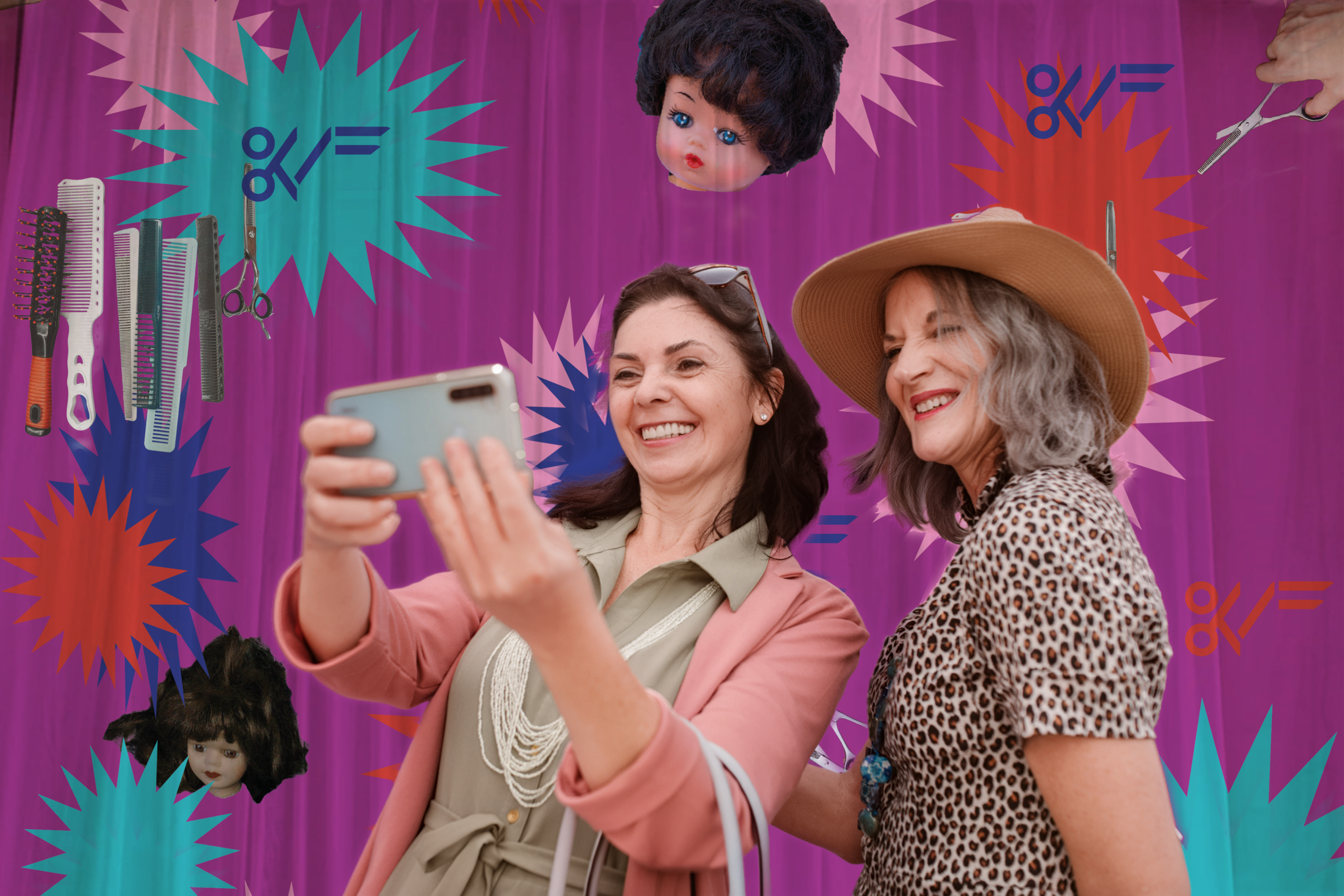
We wanted to make space for the generation X of our local hairdressers who have been forgotten and uncredited. During 90’s they made they own salons which was incredibly hard.
It was not just visual identification. This meeting was highly impactful idea.
Goal
We wanted to give them opportunity to connect with each other and show them their presence matters, by creating a coherent visual identification. To connect over their fond memories.
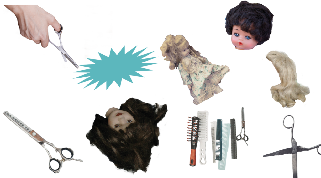
Design Principles
Bringing back the nostalgia was our main goal, thus we referred to the childchood of the hairdresser and themes present then. We wanted to induce the memories of joy and fun. To achive it, we have chosen only a few main elements – present in whole project.
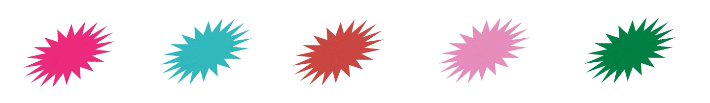
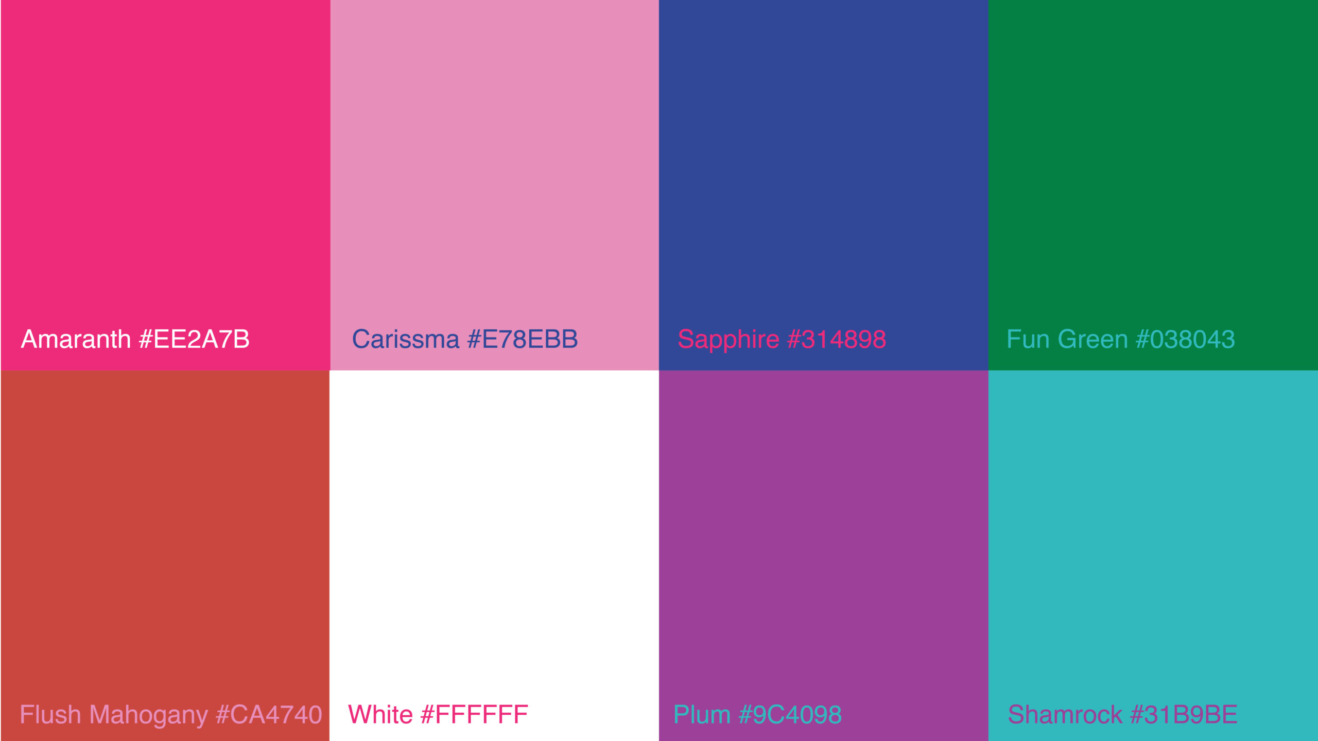
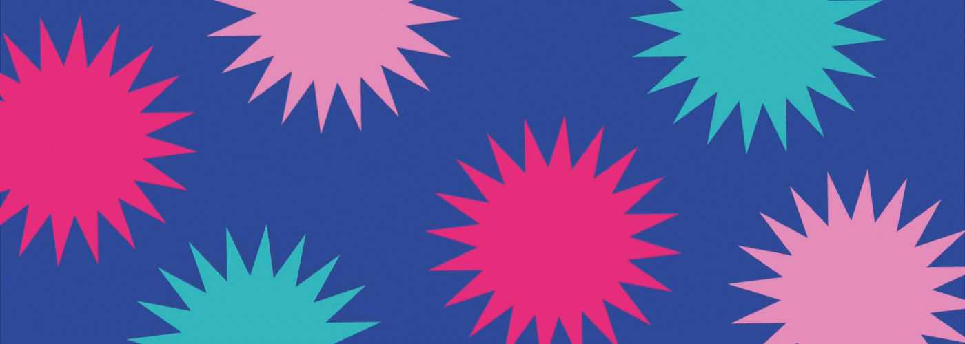
Palette
In this palette we needed to focus on those colors that were available and popular when this generation of hairdressers was studying.
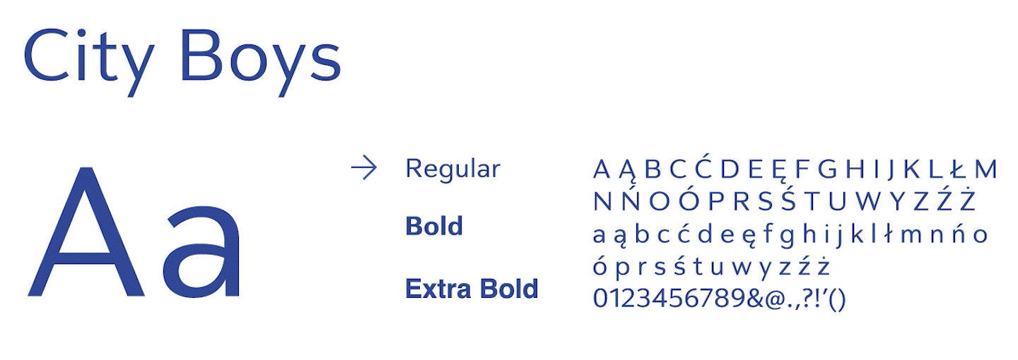
Typography
We have also taken inspiration from materials available when the target group was just learning their profession. That’s why we have chosen simple font referring to magazines published in 80’s.
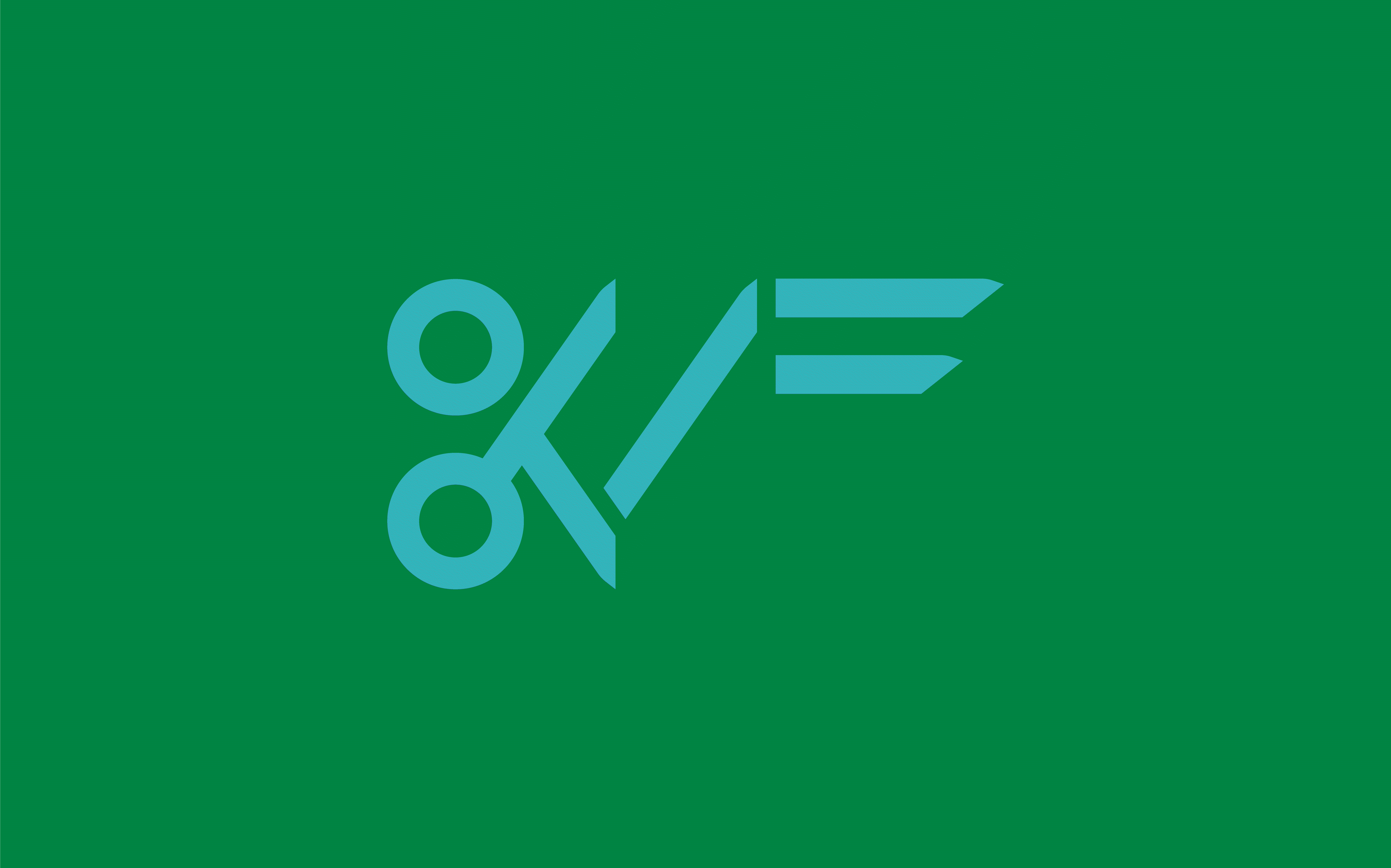
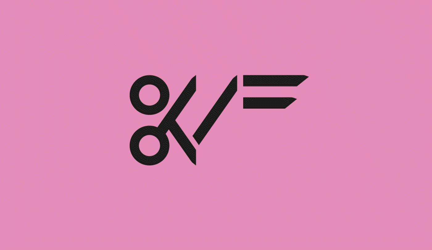
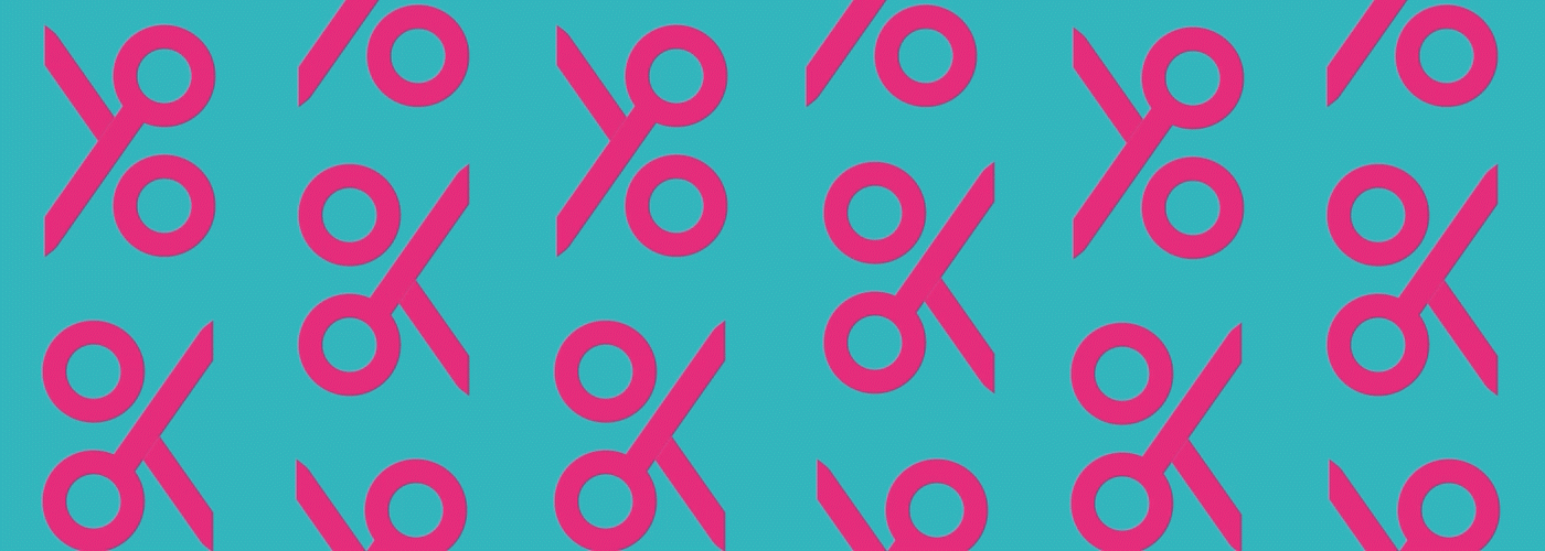
Logotype
Logo is constructed from simplified letters K,Z,F wich are the shortening of the event name Krakowski Zjazd Fryzjerek. Letter K is morphed witch symbol of scissors. We wanted our logotype to be sharp and energetic for it to embody the spirit of that event.
Here is a specification of allowed usage of colors and sizes of a logo.
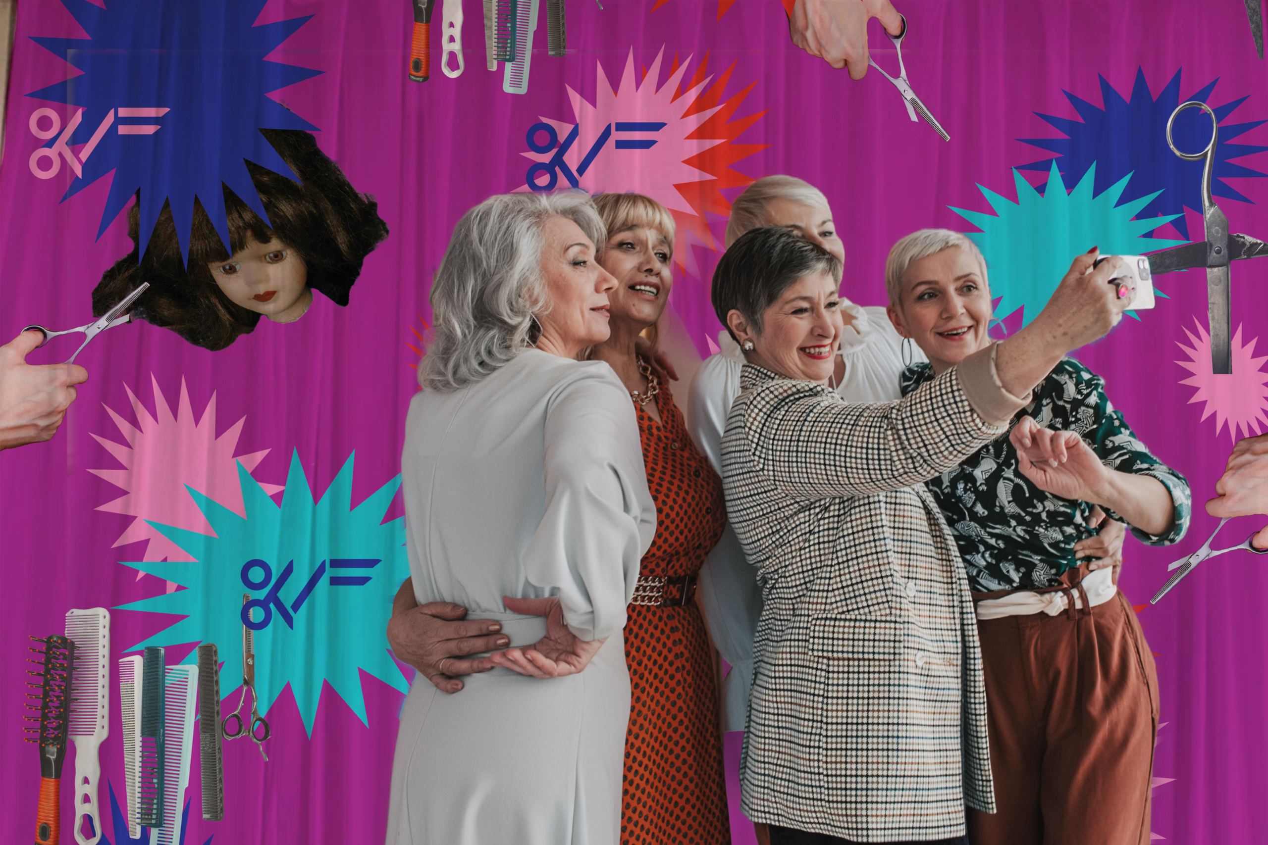
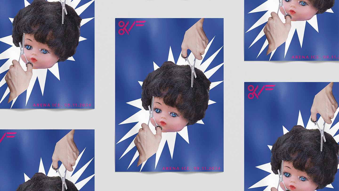
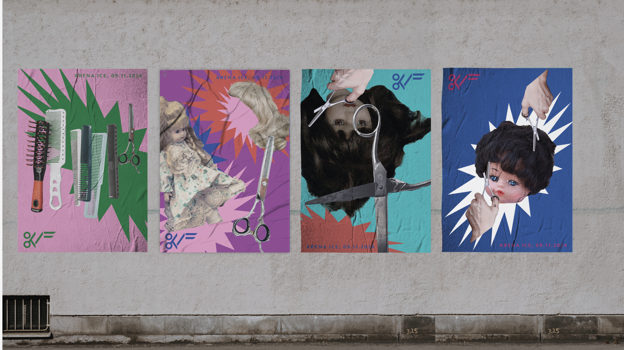
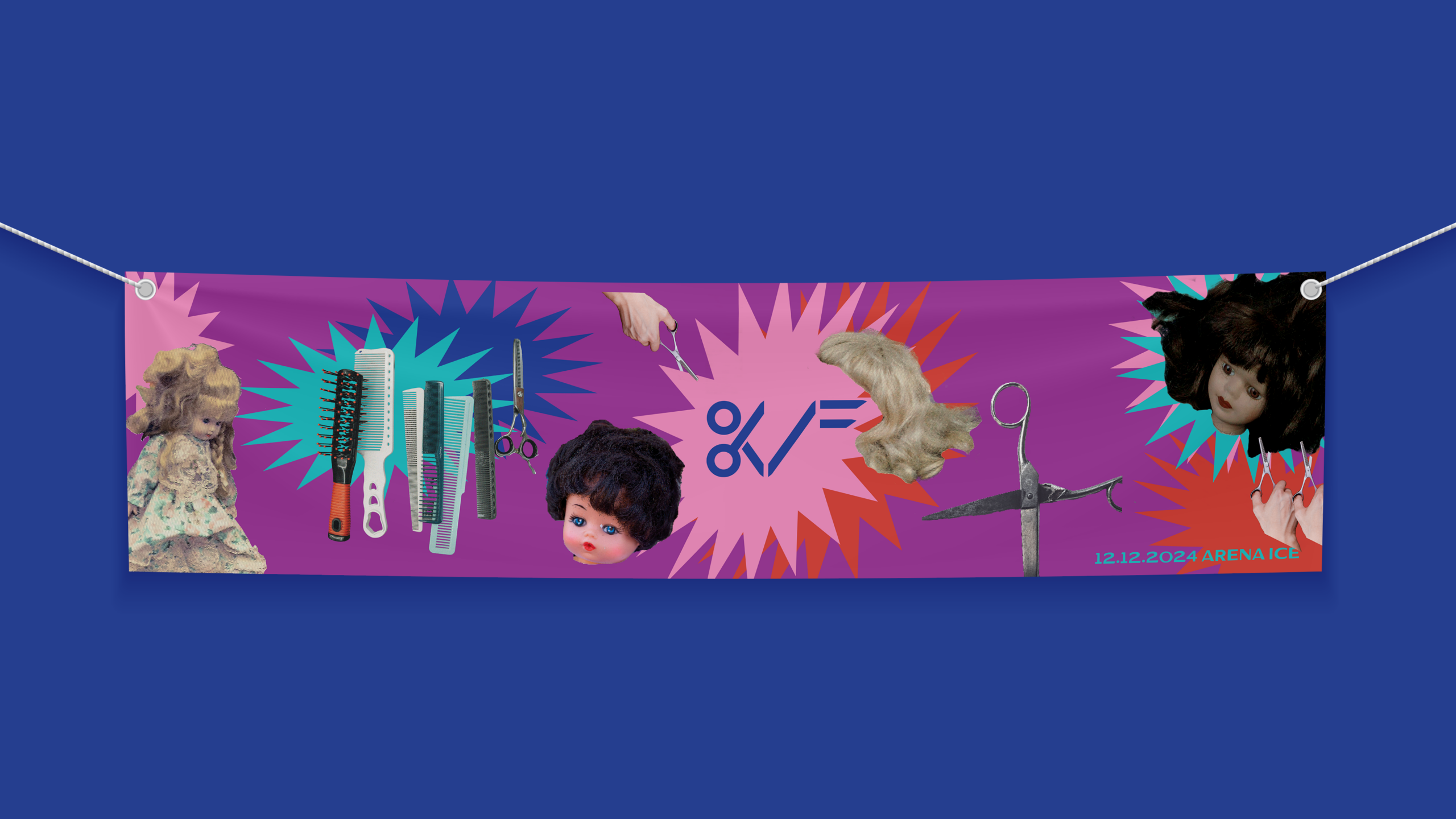
Posters
Posters are meant to be inviting, depicting the joy of childhood and creative hairstyling. Each of us made one of them. Together, they create consistent series.
I prepared the grid for all of them, making a clear visual rule for the placement of logo and date, while the designs including our themes and patterns
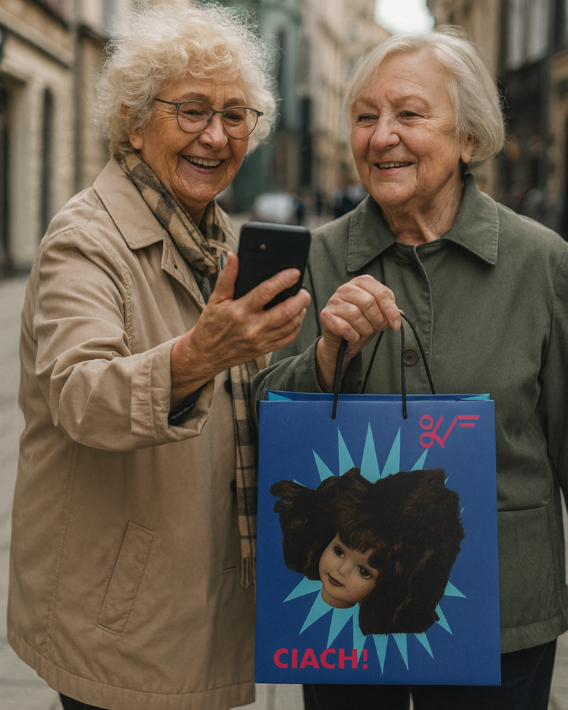
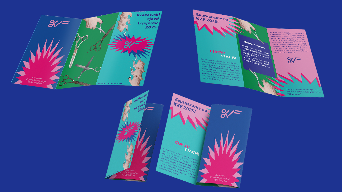
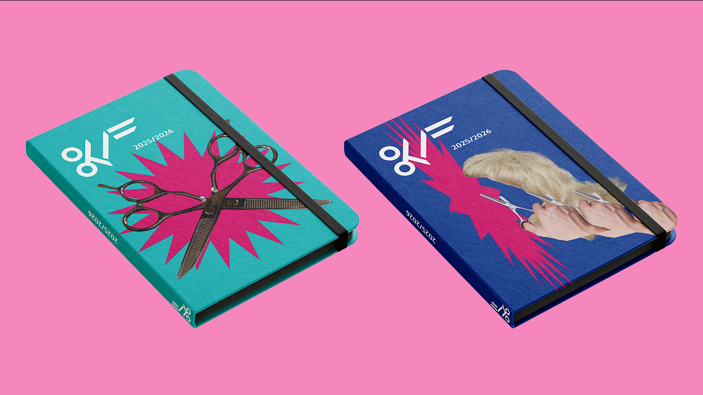
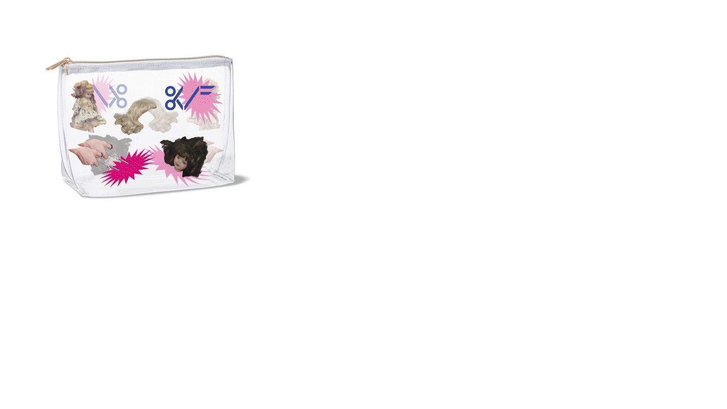
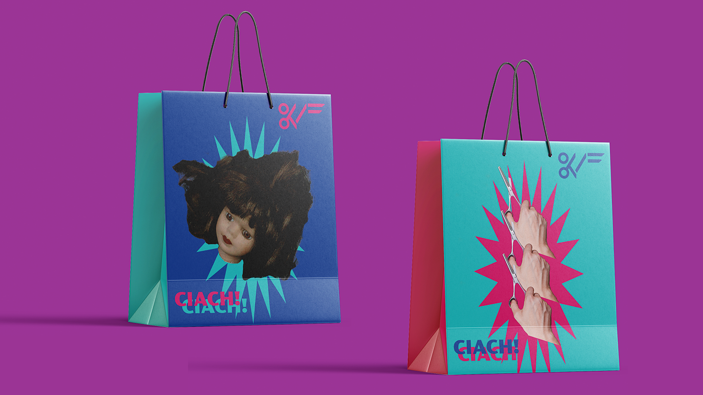
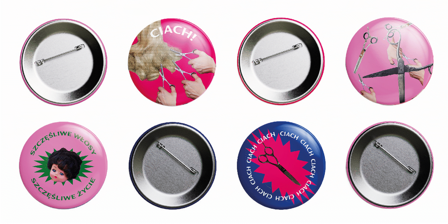
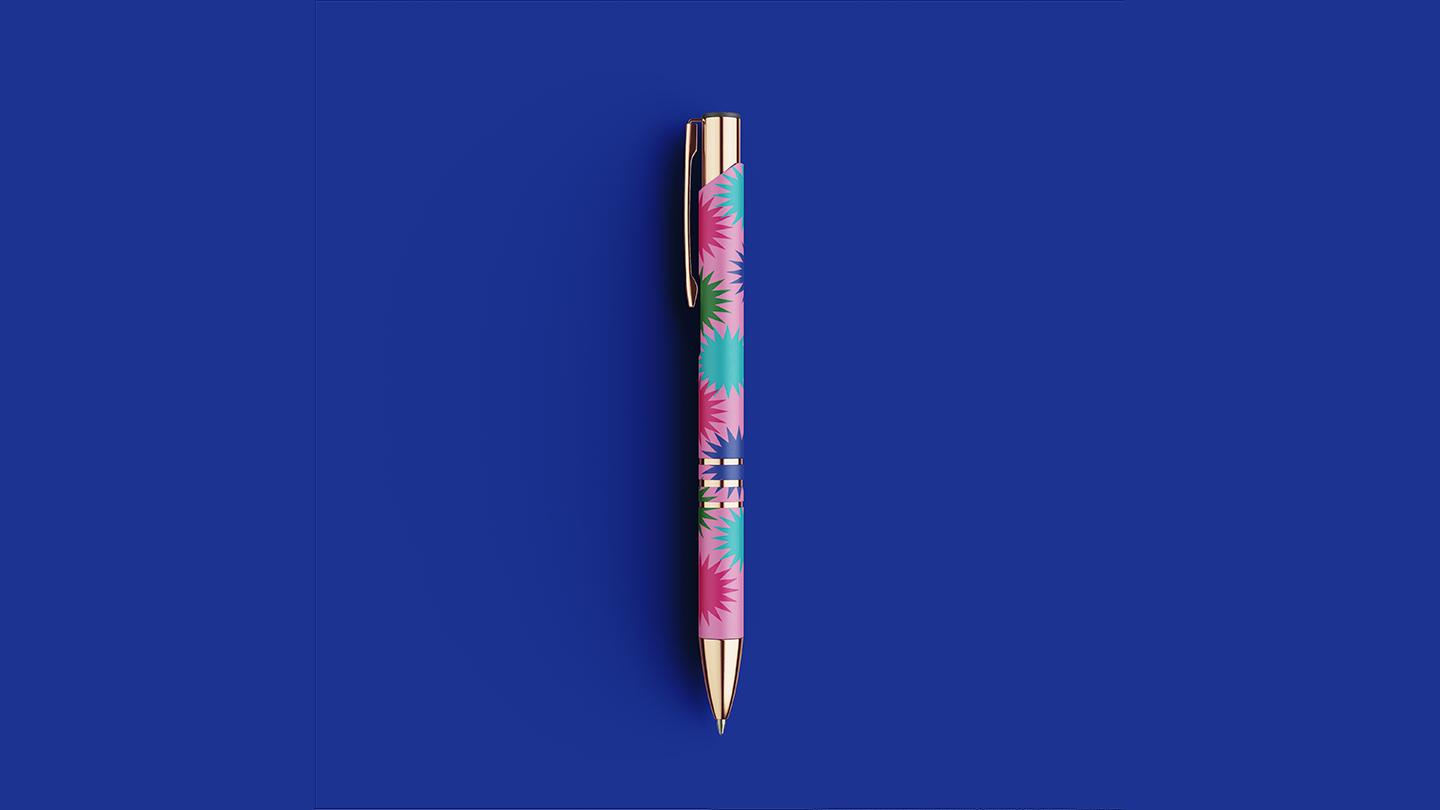
Products
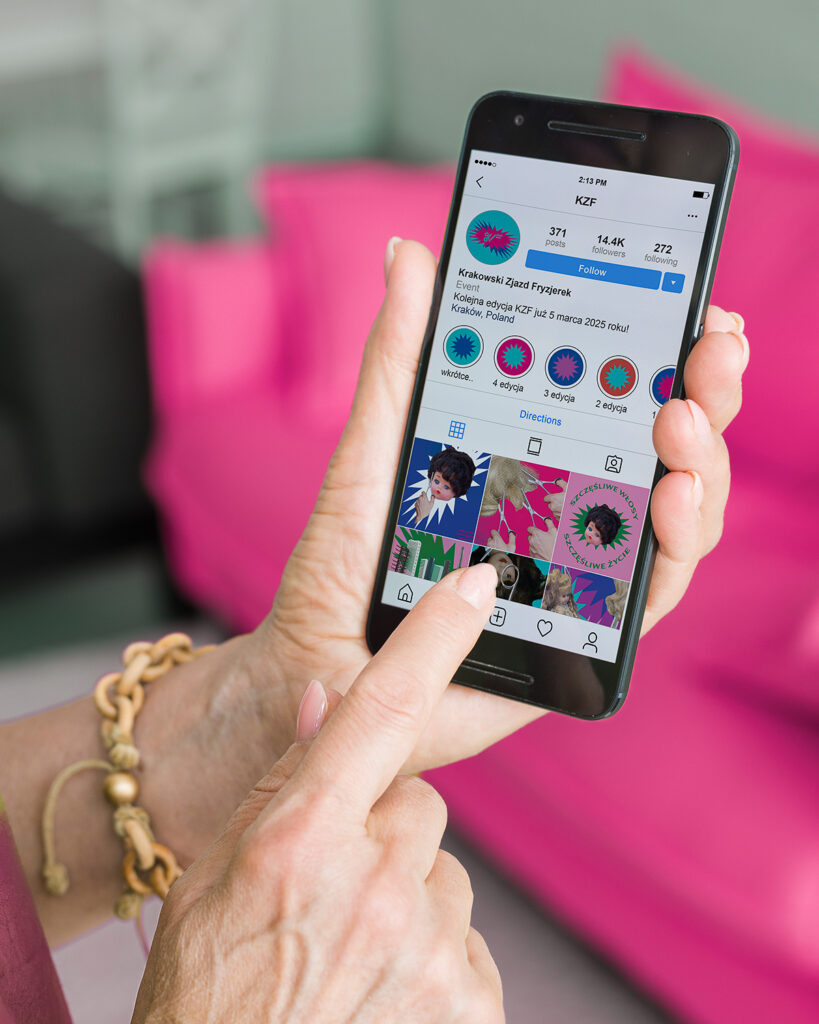
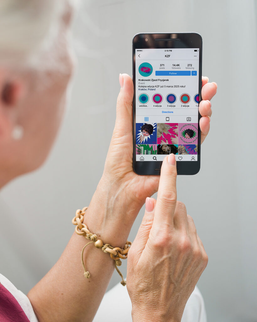
Promotional materials were physical as well as virtual. To decorate the event I created the banner. To easily share the plan and vital information with all the hairdressers there was a pamphlet made.
Accessibility was our main goal, so all of the news were posted on social media as well.