APP KZF

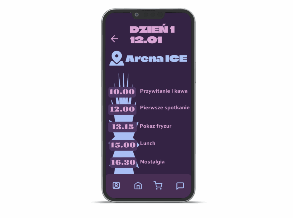
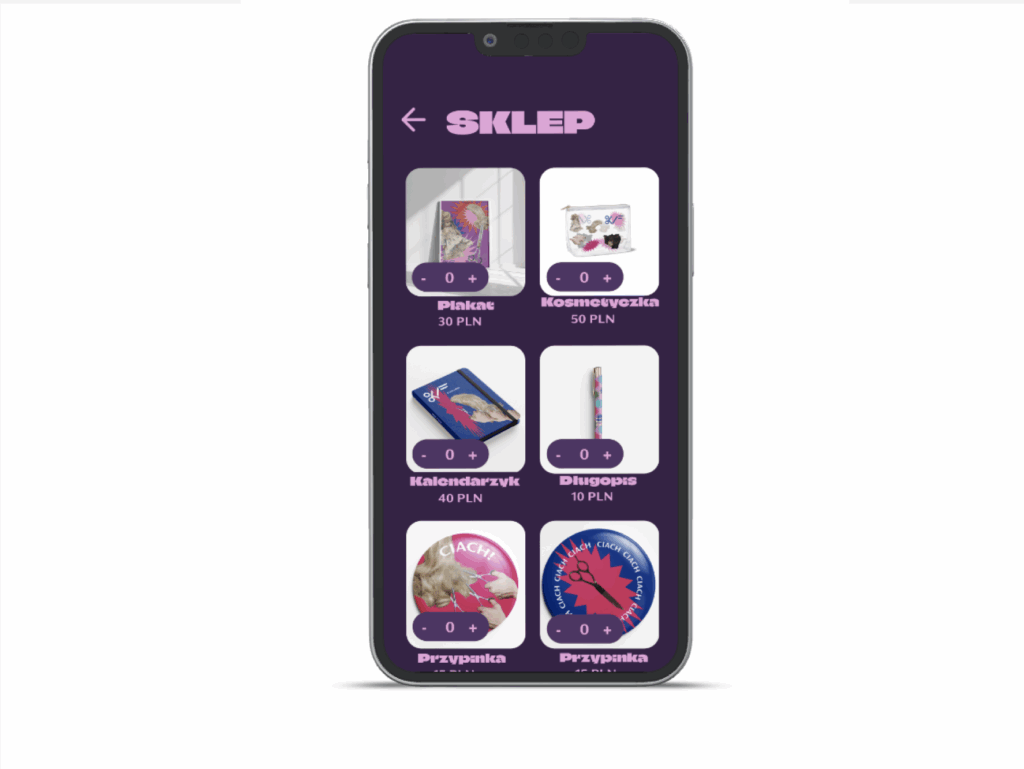
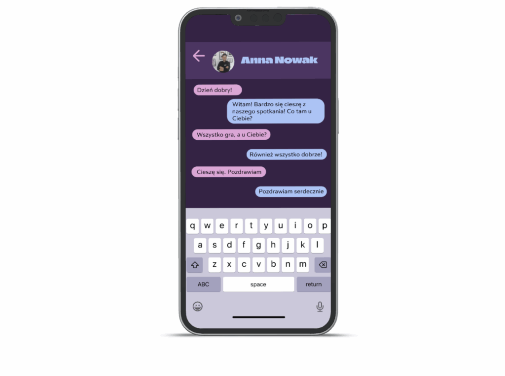
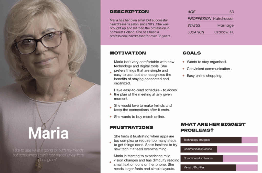
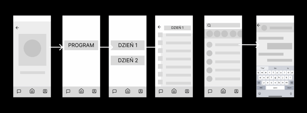
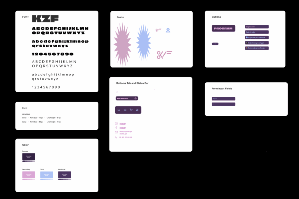
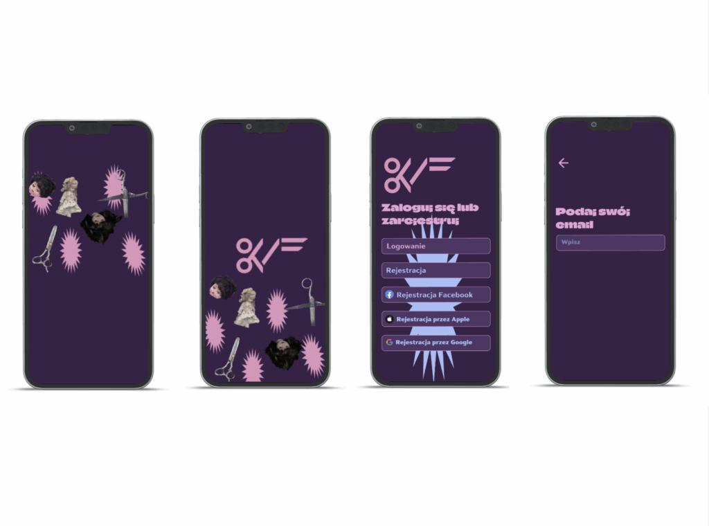
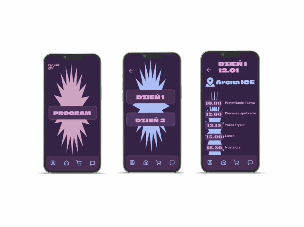
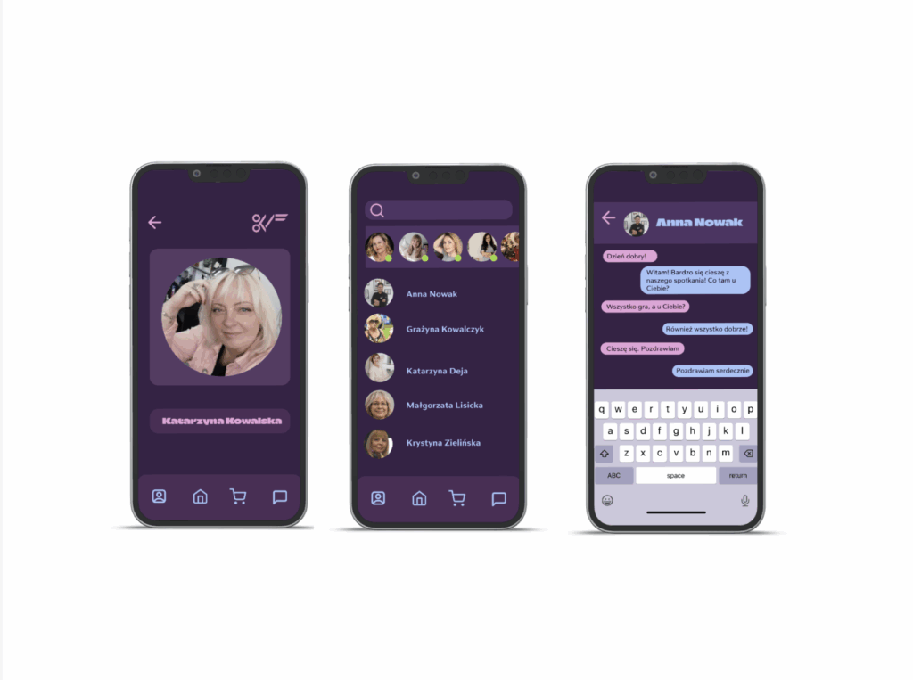
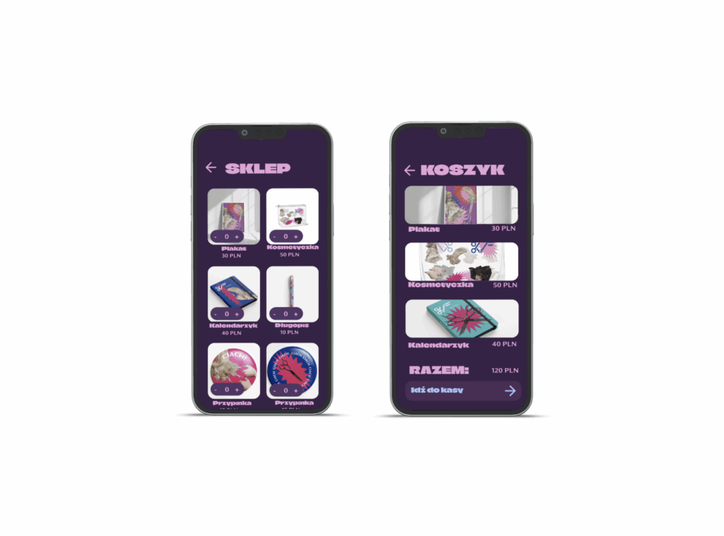
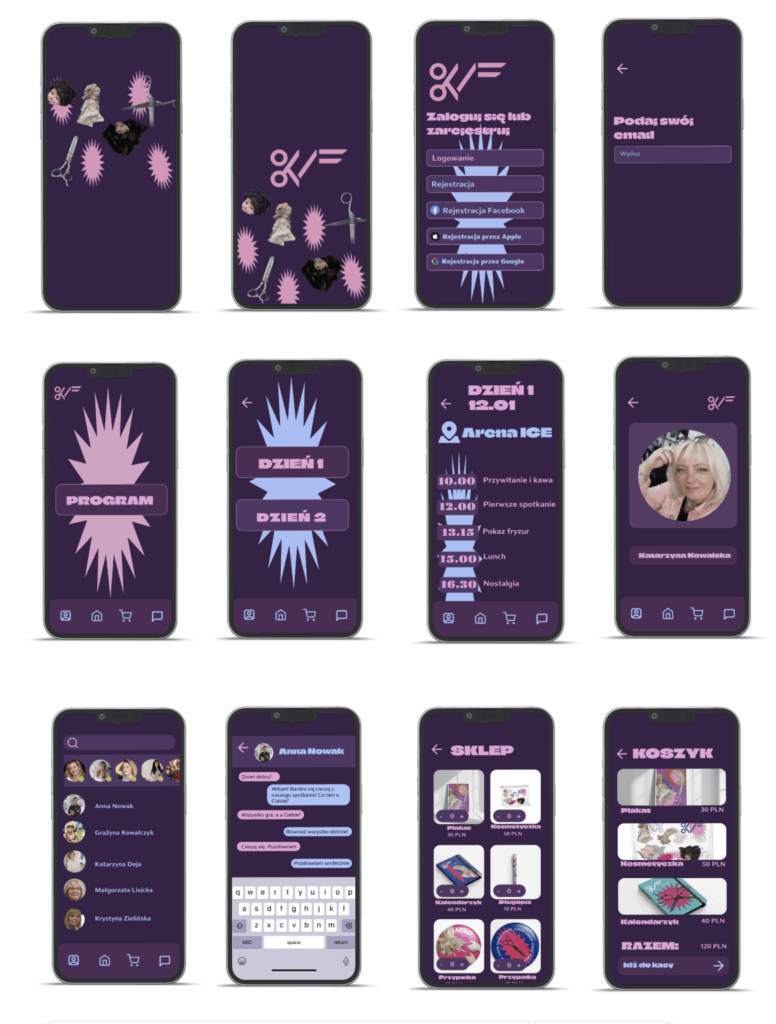
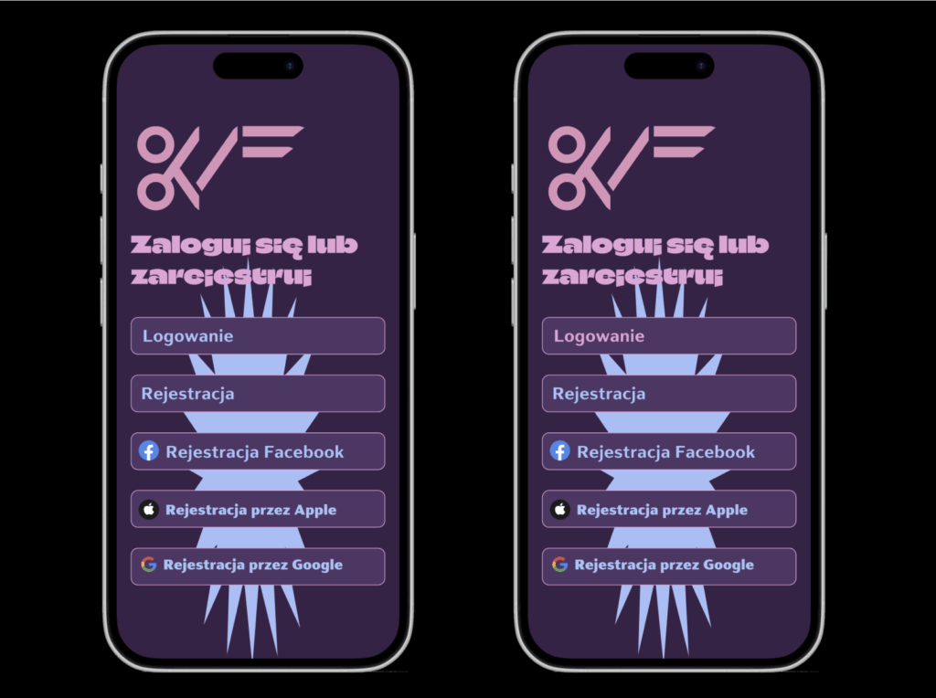
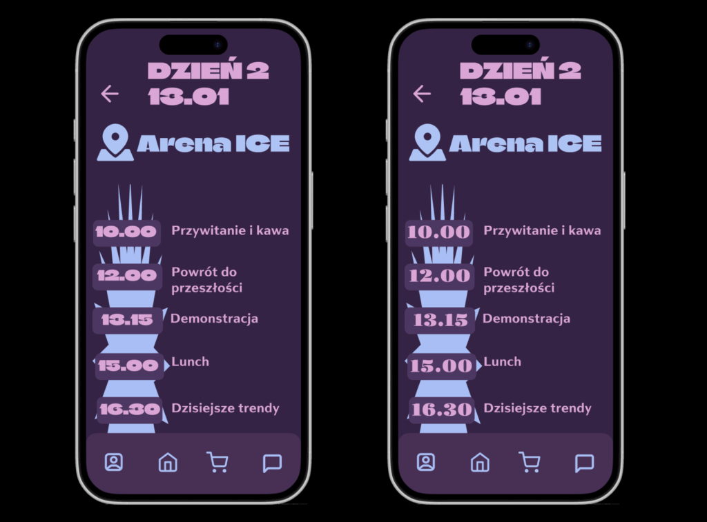
This app was created in mind with highly marginalised group in tech – hairdressers over 50. I’ve put most impact at making it easy to use. The color contrast are dominant and the typografy is big, making it covienient to get needed information. App has been created as the help in organising the event we have created branding for. Therefore I have used many elements of the visual identification to make them coherent.
Solo project
My role
Duration
Tools

Product Design – UX researcher, UI designer

1.01 2025 – 1.03 2025

Figma

Overwiev

CHECK THE SCHEDULE

BUY EASILY

MAKE FRIENDS

Problem


The Generation X of hairdressers felt overwhlemed with new technologies and needed a simple app to help them keep track of the event.

Goal


My goal was to create an app that would be intuitive for them, not complex and visually accessible also for those who have sight problems. I was supposed to help them connect with one another and check the changes in schedule.

To illustrate the problems average users was facing I have created a perosona representing the struggles.

Research


To create an app tailored specifically to the needs and expectations of a target group I have conducted the one-on-one interviews with five hairdressers. I was asking them questions that would deepen my knowledge about their situation and a point of view.

My biggest questions were:
How do you currently keep track of your schedules?
What difficulties do you face with technology in general?
Would you find it helpful to have an app that provides instant schedule access, messages, and a shop?

Interwievs


I interviewed 15 users of mobile phones over the age of 50.

95%

Users were interested in seeing the schedule

90%

Would like to send messages

65%

Respondents wanted to buy online 

Biggest problems

1.

Being fearful that the information will be unavaible

Wanting to know the plan

2.

Need to connect

Wanting to keep the connections

3.

Being unable to buy merch

After the end of the event the users wanted to

Lo-Hi wireframes
Desing system


While creating a user interface for a project I used the principles used in branding. The app was supposed to be friendly and inviting yet clear visually. My priority was accessibility.

Solutions

1.

EASY AND BEAUTIFUL REGISTRATION

Intuitive registration process was important to enable the users quick signing up.
When they enter it shows an animation using logo and elements of event branding.

2.

FUN, ACCESIBLE AND SIMPLE SCHEDULE

The app has been created to support the event, so the home screen is the one with button programme. Making it easy to access and find whatever information you need.

3.

MADE TO CONNECT

One of the most important aspects of the event was making the communication between participants available.
Therefore, each user can create their profile and send messages to other hairdressers.

4.

SHOP EASILY

After the event, users can buy some of the merch such as posters, pens, calendars or cosmetic bags, all of them have unique designs and were created with the thought of target group.

Prototype
Hi-fi wireframes
The problems solved after user testing

1.

Registration

To make the process of registration more intuitive I changed the color of registration to pink. It highlights this option to older user, who were confused what to choose.

2.

The font for the hours

This visual aspect was problematic as the numbers in the font of first choice were too similar to each other.

Have Project in Mind?

Let’s Turn your Ideas
into Reality

Przewijanie do góry