This project was created for LockedTrade, a company that only had logo and two colors in their visual identification. They needed modern looking landing page, that would enourage potential traders to buy their courses and engage with offers.
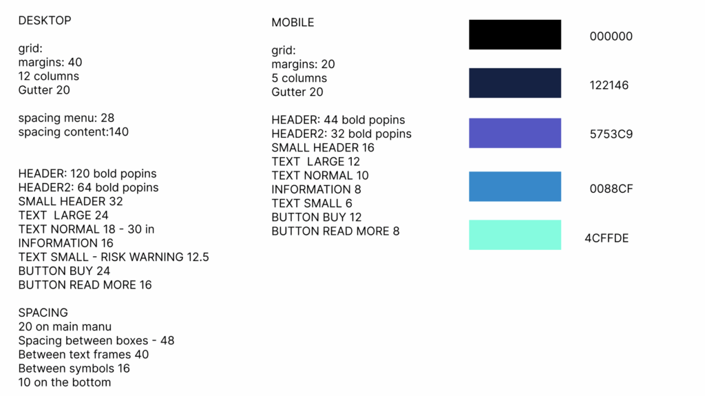
I have created a simple design system that was the base to create both a desktop version as well as mobile one. The cooperation on the project was one of the best ones, communication with managers and developers couldn’t have been easier.
Solo project
My role
Duration
Tools
Product Design – UX researcher, UI designer
1.07 2024 – 07.07 2024
Figma
Overwiev
Acces everywhere
Across all Devices
SIMPLE INFORMATION
Problem
Complexicity of information and offers was to overwhelming to avarage user who couldn’t decide.
The previous desktop experience was overloaded with information, making it difficult for users to focus on key market data. Complex tools were scattered across multiple screens, and the lack of a structured visual hierarchy caused confusion, especially for new traders. As a result, users struggled to analyze assets efficiently and often abandoned the platform before taking action.
Goal
To make complex trading offer look accessible and clear to a wide rage customers by providing a full analytical workspace, by giving users access to detailed charts, data dashboards, and complex tools.
Building trust through clarity – presenting financial information in a structured, highly readable layout that supports longer, more focused trading sessions.
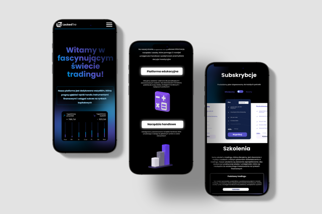
Mobile version
In trading, speed and clarity directly influence user confidence – especially on mobile. Most users check market movements, open positions, and manage portfolios while on the go. A well-designed mobile experience ensures they can act instantly, without friction or delays.
A strong mobile version is not just a simplified desktop site. It requires intuitive navigation for complex data, clear visual hierarchy, fast loading times, and interfaces optimized for quick decision-making. When users can easily monitor charts, execute trades, and track performance from their phone, engagement rises and abandonment drops.
For this project, creating a responsive, mobile-first layout was essential to improving trust and usability. The result is a trading experience that feels fast, secure, and effortless – no matter the device. This made clients engage better and make quicker decisions.
Desing system
While designing the user interface for this project, I focused on creating a modern, tech-forward look while keeping all information clear and accessible. The website balances contemporary visual aesthetics with user-friendly layouts, ensuring that even complex trading data is easy to read and act upon. By combining modern design principles with accessibility considerations, the platform provides a seamless experience for both desktop and mobile users.
Solutions
1.
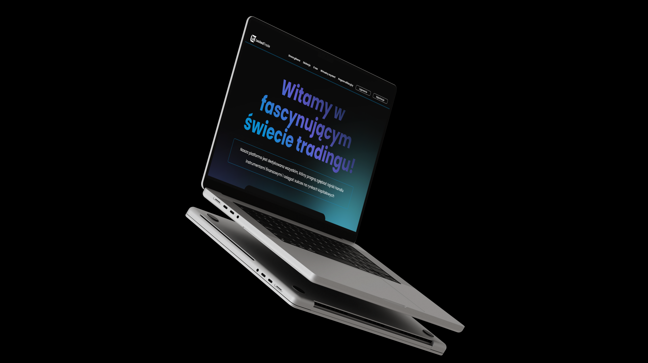
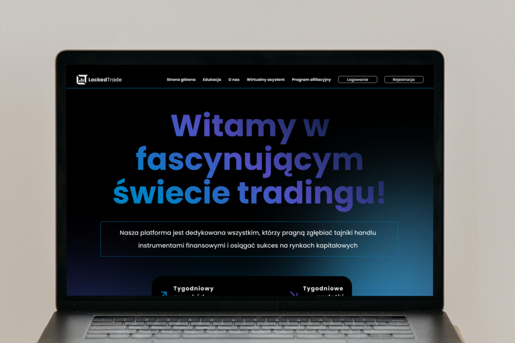
introduce yourself
The warm welcome to everyone coming to the home page.
2.
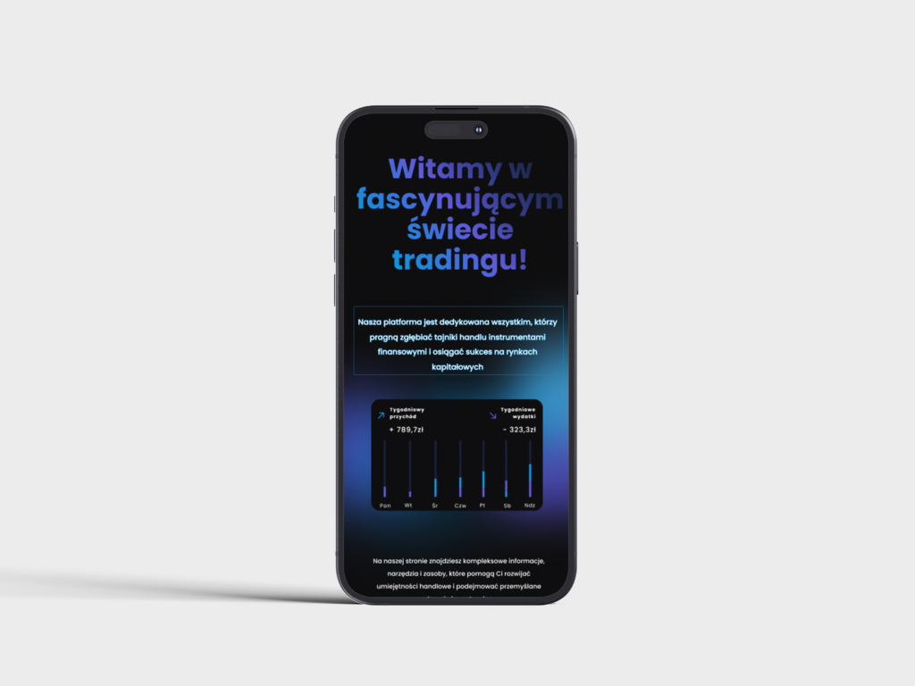
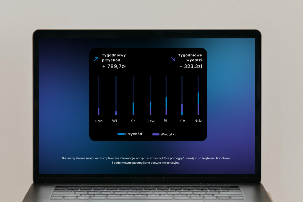
SHOW EFFECTIVENESS
Statistics show how the platform is helping clients reach their goals.
3.
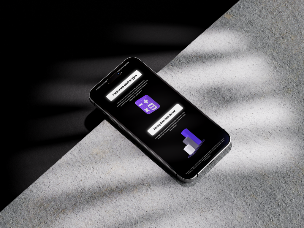
Tech design
With 3D illustrations we achieved modern look.
4.
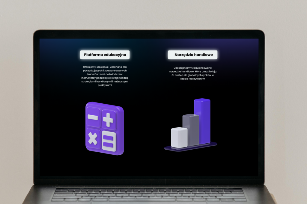
Iconify
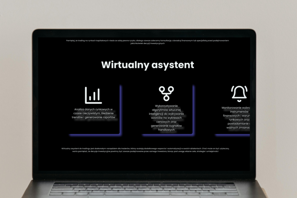
Visual representation of key information.
5.
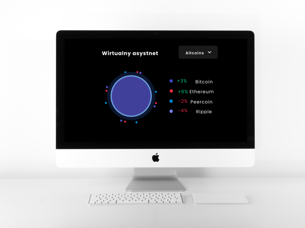
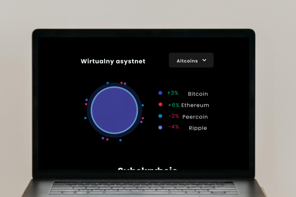
LIVE VIEW
Every minute changing chart shows accurate data.
6.
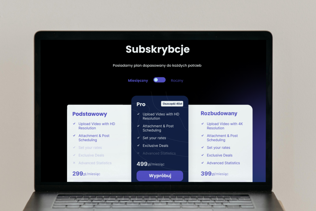
Choose your plan
Subscription offers with big CTA attracted new customers.
7.
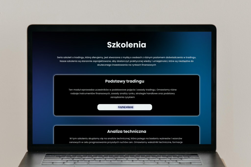
BE AWARE
Wide offer of courses allows you to choose the most suitable one for you.
8.
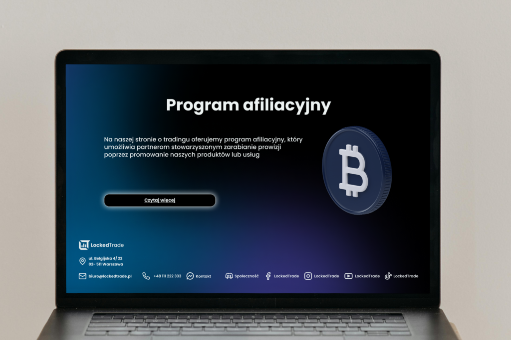
COMMIT
At the bottom of the page continue browsing the page to commit to one of the plans.