sAVE UP

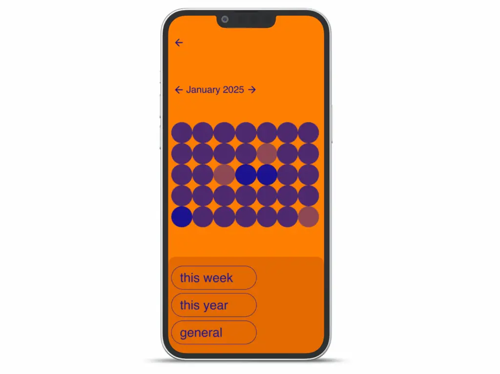
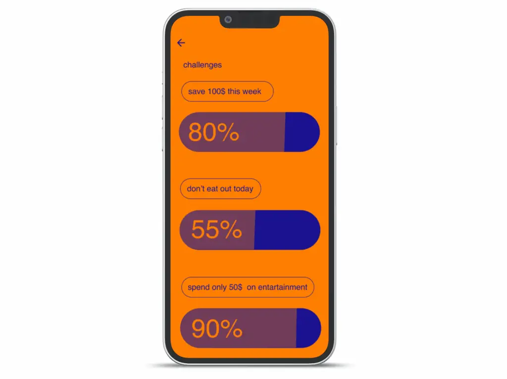
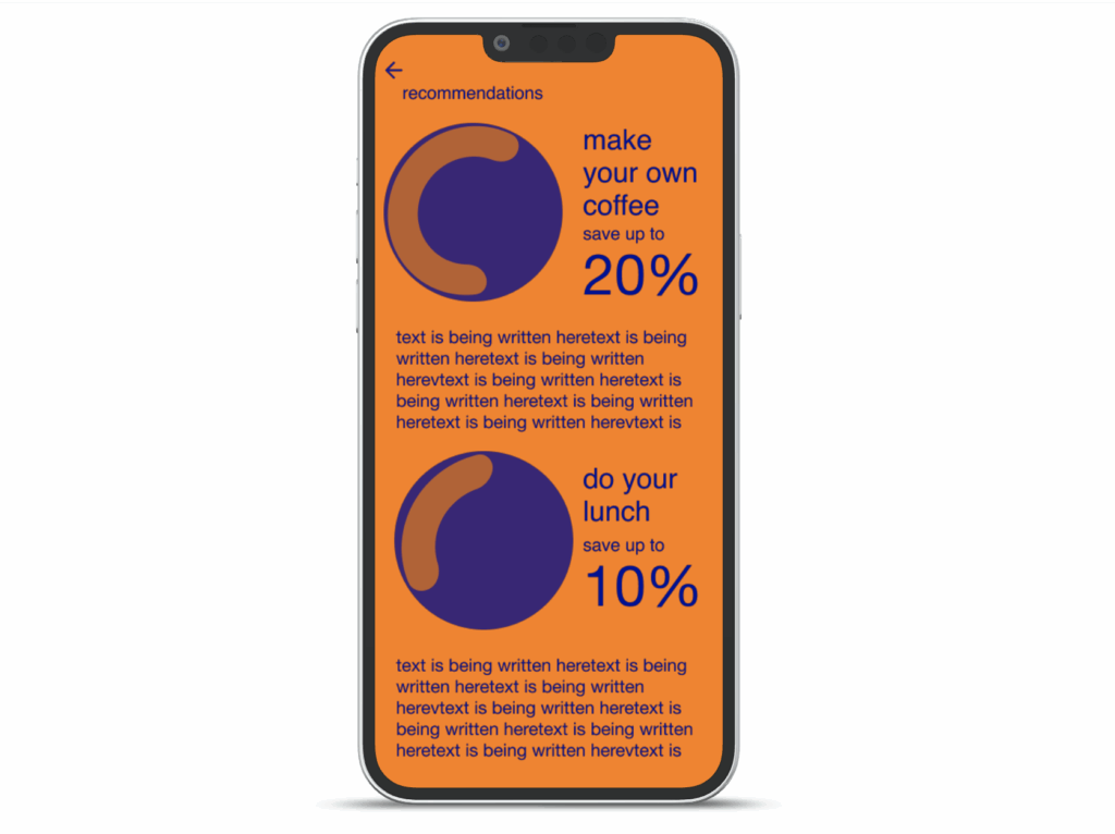
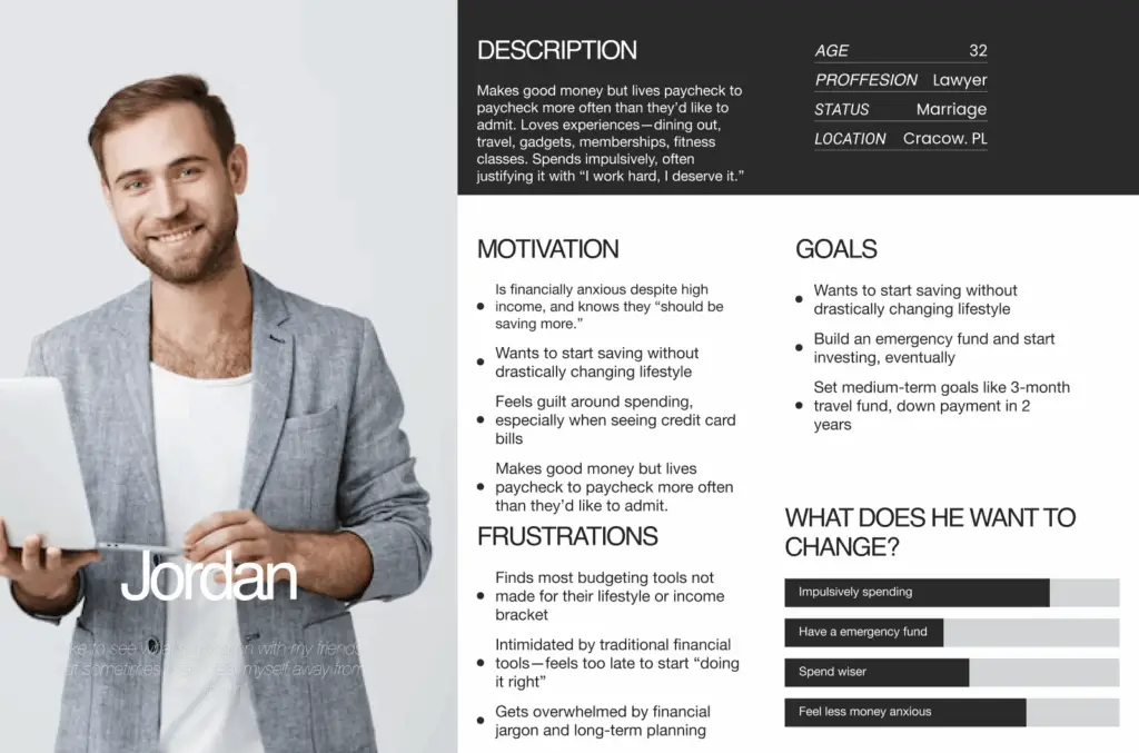
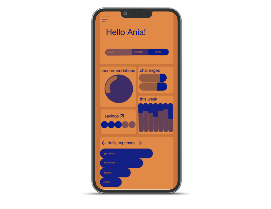
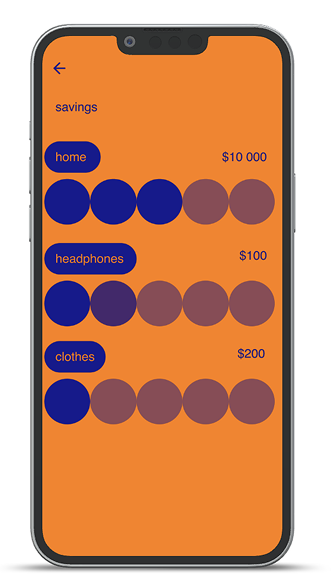
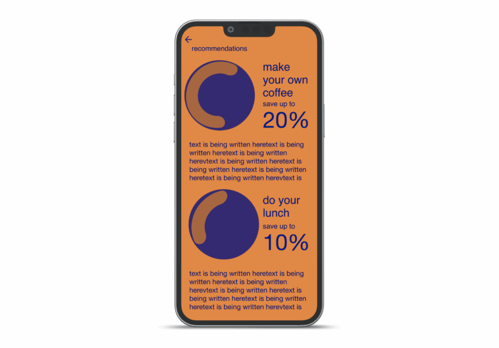
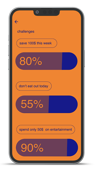
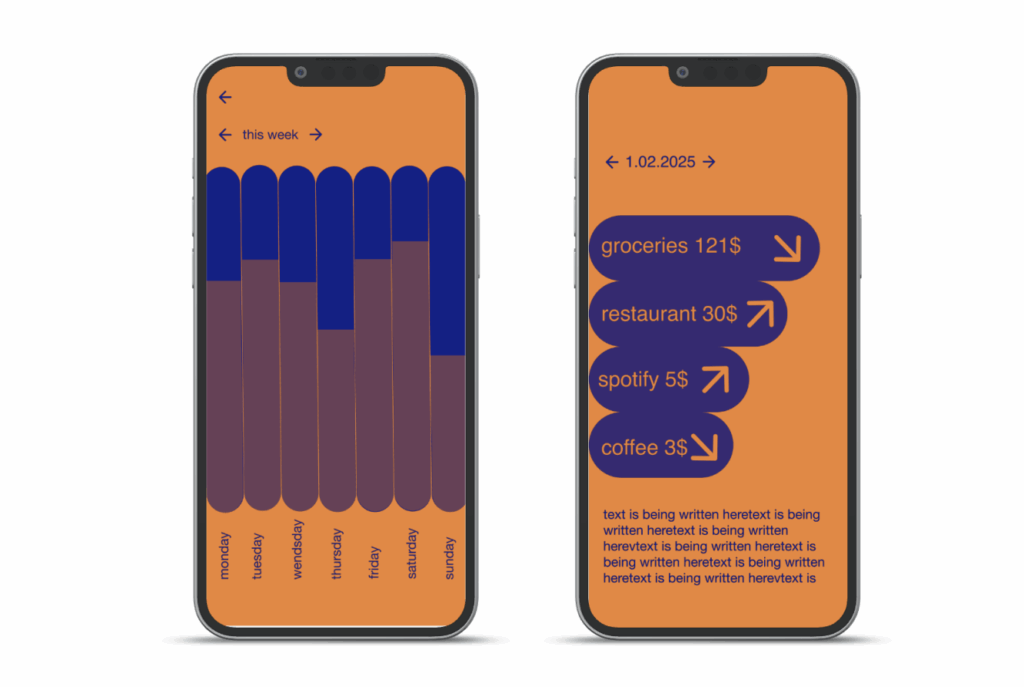
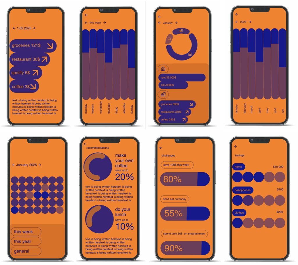
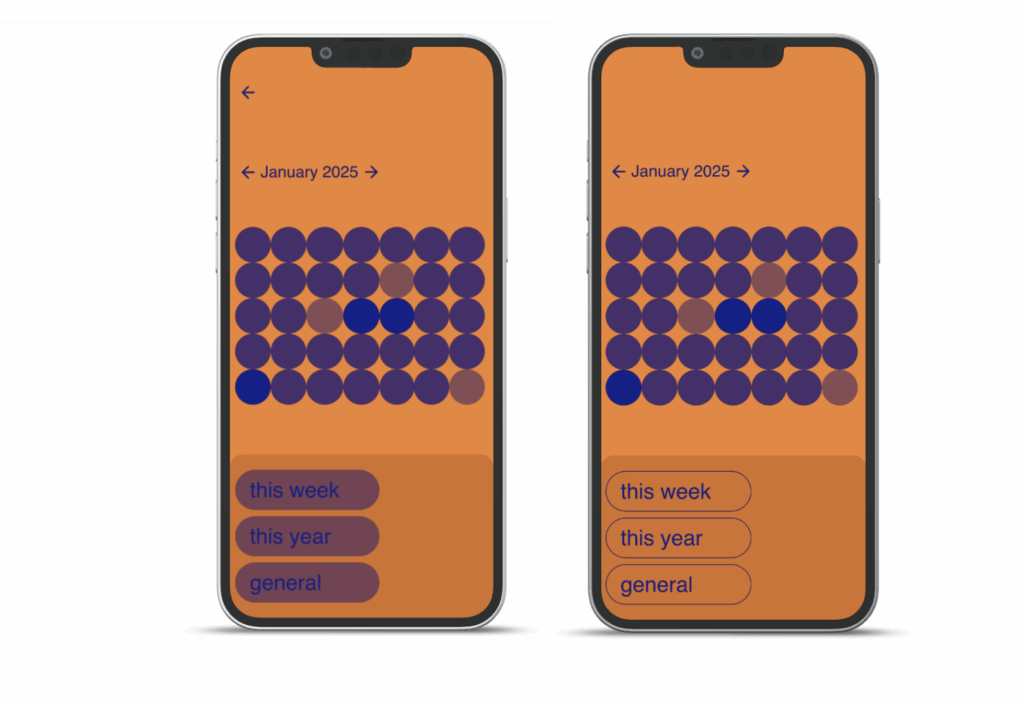
In a world where financial literacy is increasingly important, many people – especially students and young professionals -struggle to maintain healthy saving habits, despite having access to budgeting tools and banking apps. With this in mind, I set out to explore how a savings app could go beyond basic tracking to actually motivate users to take control of their finances through AI-driven insights, visual feedback, and gamified challenges.
Solo project
My role
Duration
Tools

Product Design – UX researcher, UI designer

1.01 2025 – 1.04 2025

Figma

Overwiev

GAIN 
CONTROL​

GET CHALLENGED

CHANGE HABITS

Problem


Traditional banking apps suffer from low user engagement among Gen Z users. They provide data (racking but lack the behavioral triggers needed to retain younger demographics.

Young professionals struggle to consistently save money or stick to a budget. Existing tools often:
– Feel too complex or boring
– Lack personalized guidance
– Don’t provide enough visual feedback
-Fail to motivate users emotionally or habitually

This leads to frustration, inconsistent use, and missed opportunities to build better financial habits-even for users who want to improve.

Goal


Design a 'financial companion’ MVP that increases Daily Active Users through gamification, converting high-churn users into long-term savers.

An app that goes beyond basic tracking by offering:
– AI-powered insights tailored to the user’s lifestyle and habits
– Clear, visual statistics that make progress feel tangible
– Daily and weekly challenges that gamify saving and make it fun
– Budget planning tools with flexible categories and smart suggestions
– A user experience that feels personal, intuitive, and motivating

By grounding the design in real user feedback and behavior, the app becomes more than just another tool – it helps users stay engaged and make smarter money decisions over time.

To illustrate the problems average users was facing I have created a persona representing the struggles.

Research


To better understand user needs, I conducted a series of interviews with studentsone of the most financially vulnerable and habit-forming demographics. I asked them targeted questions to learn more about their current behaviors, frustrations, and what would truly make them stick with a financial tool long-term. The questions included:
1. How do you currently track your expenses?
2. What challenges do you face when trying to save money or stick to a budget?
3. Would you find it helpful to plan your expenses for the next month in advance, and why?
4. What categories would you want to see included in a budget planner (e.g., food, rent, entertainment, savings)?
5.What would make you feel more motivated to use a money-saving app regularly?
Through these conversations, a pattern of key insights began to emerge: while most participants wanted to manage their finances better, the existing tools felt overwhelming, un-engaging, or simply not aligned with their daily habits. Many expressed interest in visual statistics, personalized suggestions, and small, achievable challenges that make saving feel more rewarding and less like a chore.

Market Validation & User Pain Points

I interviewed 20 students who want to change they saving habits.

70%

Users were not satisfied with the way they save money.
They were doing it by:
– checking their accounts
– setting a time limit
– taking the money out of the bank

95%

Were unhappy because of the amount of moeny they have spent.
They wanted outside system that would help them not to buy so much:
– coffee
– food at the restaurants
– clothes

85%

Said that if an app would have better categories of expenses like:
– alcohol
– coffee
– subscriptions
And clear user interface they would use it.

This prototype will show how those findings shaped the design direction of a next-generation savings app that empowers users with smart insights, intuitive visuals, and a motivational experience that meets them where they are.

Biggest problems

1.

Having tried budgeting apps and finding them boring, tedious, or overly rigid

Apps being not modern anough

2.

Activities outside the smartphone

The need of having more activities in real world

3.

The ability to be present

Want to be more calm and relaxed

4.

Alienation of users

Feeling like nobody understands them

Measuring Success: Key Performance Indicators (KPIs)


To ensure the design not only solves user problems but also drives business growth, I defined three core metrics to measure the product’s success post-launch:

1. Day-30 Retention Rate

  • Target: >25% (Industry benchmark for Finance Apps)

  • Business Rationale: The core problem is inconsistent saving habits. Success is defined by users returning to the app after the initial „novelty” wears off. The „Daily Challenges” feature was specifically designed to drive this recurring engagement.

2. „First Goal” Conversion Rate

  • Target: 60% of sign-ups

  • Business Rationale: Users who create a savings goal within their first session are significantly less likely to churn. The onboarding flow was optimized to guide users to this specific „Aha! Moment” as quickly as possible.

3. Viral Coefficient (K-Factor)

  • Target: >1.2

  • Business Rationale: By integrating social leaderboards and „Friend Streaks,” the design encourages organic growth. A K-factor above 1.0 means the user base grows self-sufficiently without heavy reliance on paid marketing (reducing CAC).

Userflow
Lo-Hi wireframes
Solutions

1.

CREATE PERSONAL PLAN

Creating aa personalised plan with help of ai so that it matches your short term and long term goals.

2.

GET USED TO FRIENDLY INTERFACE

The visual information is clear and made in mind with the user preferences.

3.

SET THE GOALS OF SAVINGS

Pinpoint your priorities and start saving today


4.

IMPROVE WITH AI RECOMMEN-

DATIONS

After a deep analysis’ of your habits the app will show you the most easy solutions for saving the biggest amount of money.

5.

GET MOTIVATED BY CHALLANGES

To pursue your goals take part in quick challenges like „Don’t eat out this week”.

6.

USE CALENDAR AND CHECK YOUR STATISTICS

Always in control – check how you are doing this week compared to the one before with calendar.

Hi-fi wireframes
The problems solved after user testing

1.

The buttons

It was unclear which texts are just informationa nad which are the buttons. I had solved this by incorporating the stroke around them symbolising yhe buttons.

Have Project in Mind?

Let’s Turn your Ideas
into Reality

Przewijanie do góry